Redesigning Mastodon
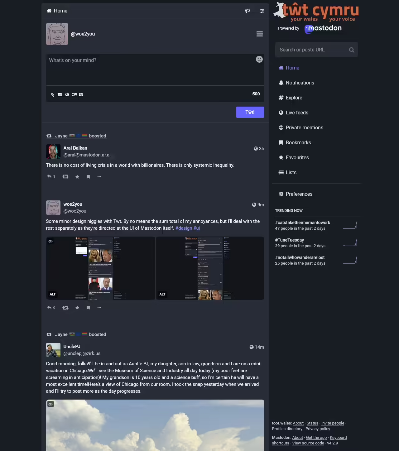
I ended up on Mastodon in the Great Twitter Exodus, specifically on Tŵt Cymru since I live and work in Wales. Overall it’s a nicer place, but I’ve been having some niggles with the UI.
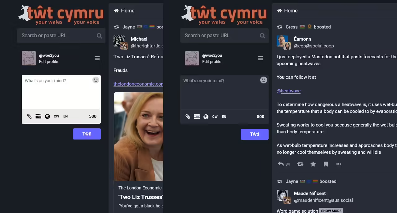
Here’s what I see when I open up the site.

Part 1: fixing the left sidebar
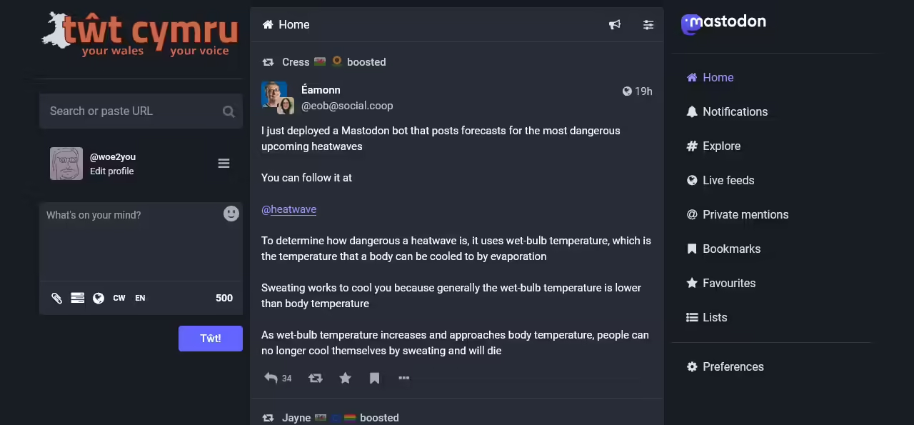
That incongruous post form has always annoyed me. It’s not styled to match the dark theme, and its size indicates it’s less important than the search bar. You’re going to be entering more text into it than the search bar, it needs all the width it can get (which is not much, crammed into this sidebar).
That’s starting to look a little better. The logo still feels crammed in though, so let’s give it the same treatment as the Mastodon logo on the right:
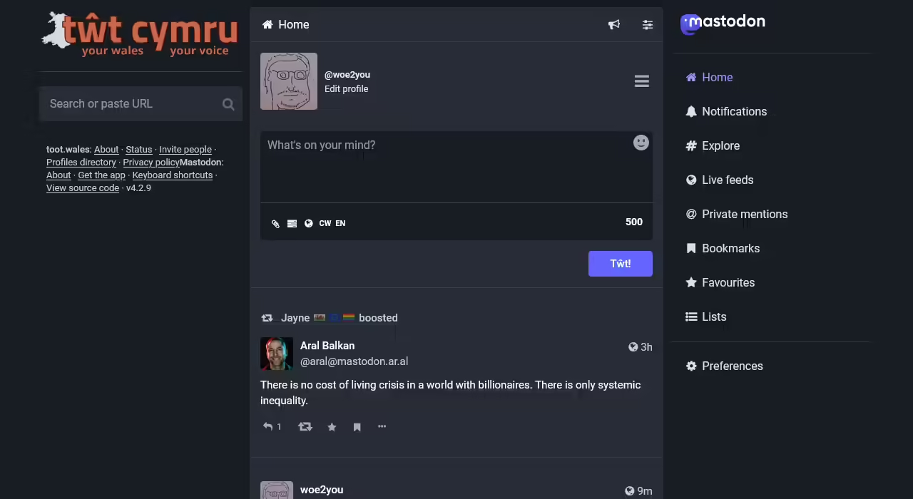
That’s about as much lipstick as this pig will take, which leads me on to more fundamental concerns with the layout and information architecture.
Part 2: we don’ need no stinkin’ sidebar
The three column layout cramps the main content area, and everything in the left sidebar could more logically be placed elsewhere.
The profile link and post form
The post form is the most fundamental part of a user’s interaction with Mastodon. They post their toot, then it appears in their local timeline in the main column (which doesn’t feel very main at the moment, but we’ll get to that). It belongs in the main column both by virtue of its importance and the fact that this is where its output appears.
The site logo and search bar
We have two main logos on the page, the site’s and Mastodon’s. There’s a clear relationship between them and how they came together to create the site, but at the moment they’re sulking in opposite corners of the page. Let’s fix that, and at the same time let’s make the relationship explicit for the sake of folks who don’t know how the Fediverse works.
The search bar is also sitting all the way on the opposite side of the page from the main navigation, where someone in need of a search bar will already be looking around.
Trending, footer links and final tweaks
Trending is another way for people to navigate around the site and find content, but it’s been exiled to the bottom corner away from all the other navigation dealing with that. Let’s move it up to below the main nav, opening up a space at the bottom of the right column for the footer links, and let’s align the footer links to break the grid aligned with the site logo at the top as a fun little callback.
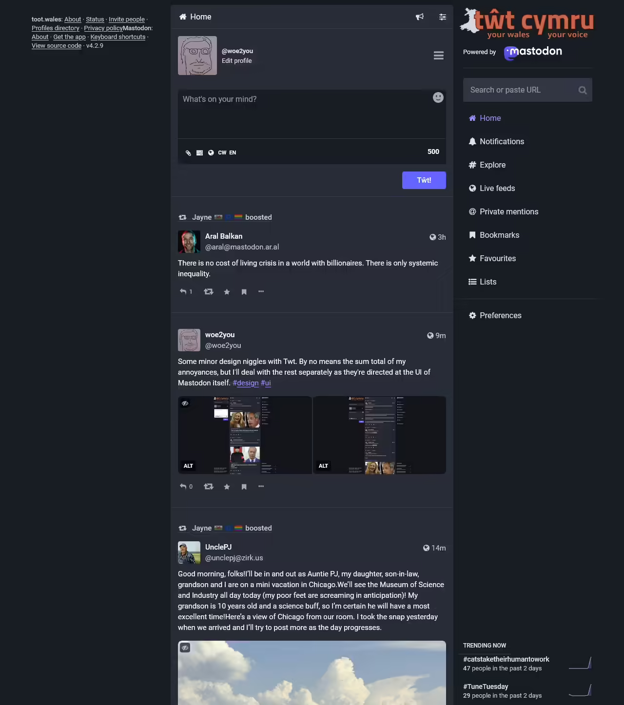
Now we have a nice clear hierarchy, with only one supplementary area to drag attention away from the main content at any point as you scroll the page and all the main navigation conveniently in one place. We’ll also expand the main column to give it a little more visual weight, and get rid of that redundant “Edit profile” link by the user’s avatar (it’s the first option in the hamburger menu). The avatar could do with being a bit smaller too now it’s next to a single line of text instead of two.
This is just the result of pushing things around in Dev Tools for a couple of hours. I haven’t looked at any layout other than desktop in single column mode, but it’s a fun little proof of concept for how much cleaner and more logical the UI could be without making drastic changes to the theme or typography.
Leave a Reply