Twitter gets a facelift: the new Twitter interface deconstructed
Twitter is rolling out a new UI for its web client, and I think they’ve got it right. 78% of users are using the website to post and read tweets, and the updated interface incorporates a lot of features previously only available in third-party clients.
So what’s new?
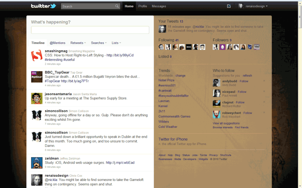
The most noticeable thing about the new interface is the wider layout with the two-column sidebar. Once the new interface has been fully rolled-out, it’s worth redesigning any custom backgrounds you’ve uploaded to take the additional width into account.
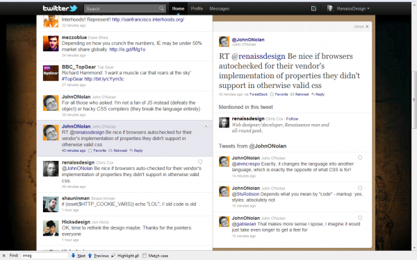
Follows, trends and suggestions are displayed by default in the sidebar, but the real magic happens when you click on a tweet. An expanded info pane slides out over the sidebar, containing meta-information about the currently-selected tweet, including the conversation (if any) and @mentions. The info pane is statically positioned relative to the viewport, and can be scrolled separately.
Media Magic
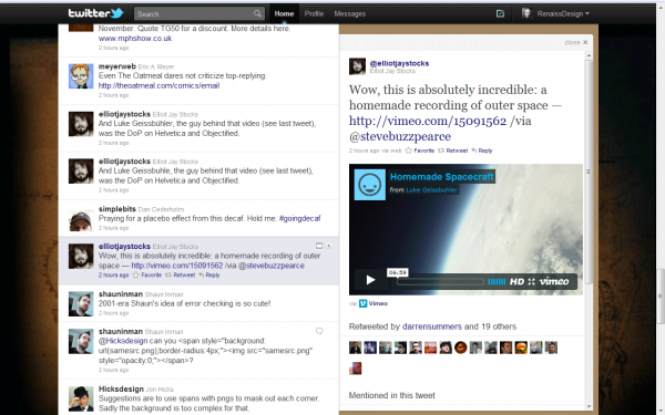
The big UX improvement that’s wowing everybody is the media integration. If a link is posted to a supported resource (currently limited to DailyBooth, deviantART, Etsy, Flickr, Justin.TV, Kickstarter, Kiva, Photozou, Plixi, Twitgoo, TwitPic, TwitVid, USTREAM, Vimeo, yfrog, and YouTube), the media will be displayed in the info pane without having to navigate away from the stream.
The Verdict
With all the new functionality, there’s even less need to use a standalone application unless you’re managing several Twitter accounts at once. Everything’s gathered together in one place and as more media sources are added to the list it can only get better.


I’m sure there are many like me who will never see these changes – the only time I use twitter is on my phone – the client on my NexusOne does everything I need.